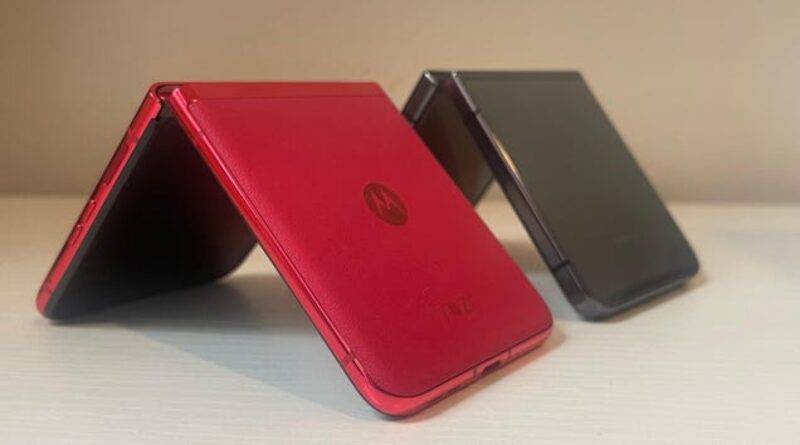
Samsung Galaxy Z Flip 5 and Motorola Razr+: Which $1,000 Foldable Is Best For You?
I have spent the past few weeks with Samsung’s Galaxy Z Flip 5 and Motorola’s Razr+. These foldables were released in late 2023 and share the same $1000 price tag. However, the Razr+ is currently retailing at a discounted price of $700, and you’re likely also to find the Z Flip 5 on sale. We figured we’d revisit the two models for foldable-curious people who don’t want to spend full price.
Should You Flip Out for This Samsung Phone? | Gizmodo Review
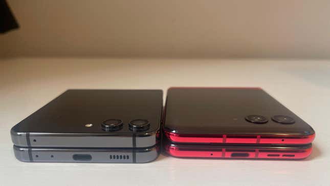
The two folding flip phones share many design similarities. They weigh the same—less than half a pound—and are the same thickness when folded. They sport the same 22:9 aspect ratio, unlike the 16:9 found on most smartphones.
The real differences are in their hinges. The two foldable devices flip closed, but their respective hinges offer promises. Samsung’s Flex hinge tech on the Z Flip 5 is designed to close tightly without a gap between either side of the device. Samsung also made it so that it could lay flat when splayed open. The Moto Razr’s hinge tech is also designed to protect its display, but it’s especially proud of the fact that there isn’t a visible crease.
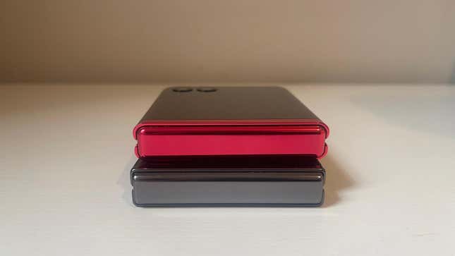
Samsung Galaxy Z Flip 5 vs. Motorola Razr+: Design
The Z Flip 5 is much easier to open compared to the Razr+. However, you still need two hands to flip the phone open. Motorola’s hinge is way too tight. It almost feels like you’re prying the phone open instead of flipping it open.
I’m also not a fan of the hinge springs on the Razr+, as it has the tendency to quickly open all the way out with a loud and harsh jerk. The Z Flip 5 offers a softer opening. The hinge on both devices feels sturdy.
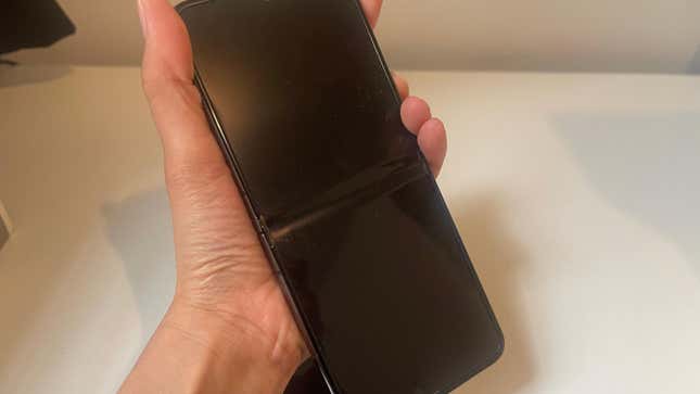
The crease is one of the things you’ll notice most on a folding flip phone. No one likes running their finger over an indentation every time they use the main display on their foldable. A bump right in the middle of the display also spoils the phone’s aesthetic.
The Razr+ does a fantastic job hiding its crease. It’s hardly there as you’re using its large 6.9-inch display. There’s a tiny dip in the center that you would notice only if you looked at your phone from a specific angle. On the Z Flip 5, however, you can’t ignore the crease. There’s a dip right in the middle, a constant reminder of the kind of phone you’re on. The crease on its predecessor, the Z Flip 4, was as noticeable as the Z Flip 5’s.
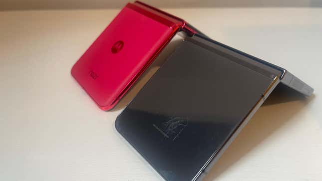
I like the vegan leather thing the Razr+ has going on. It gives it a better feel than the all-glass body on the Z Flip 5. The leather also helps keep scratches away, which was a huge issue on Samsung’s phone and made it look worn out pretty fast. Both phones offer an interesting range of colors, but the Viva Magenta on the Razr+, which Motorola sent us for review, took me back to the 2000s. It looks like a throwback to what used to be the coolest phone in 2004. I was obsessed with the hot pink Moto Razr V3 but never got to get my hands on it back then. The pink Razr+ somewhat made me feel better about my unfulfilled childhood dream.
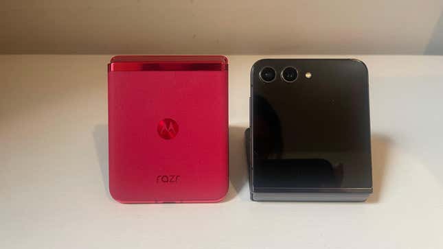
Another feature that gives the Z Flip 5 an edge over the Razr+ is its resistance against water. It’s rated IPX8, which means it can be submerged in up to three feet of water for up to half an hour. However, the dust rating isn’t high, which is one of the more crucial factors in a foldable phone since there are hinges and crevices to mind. The Razr+ is rated IP52, so it won’t survive being fully submerged for too long.
Samsung Galaxy Z Flip 5 vs. Motorola Razr+: Software
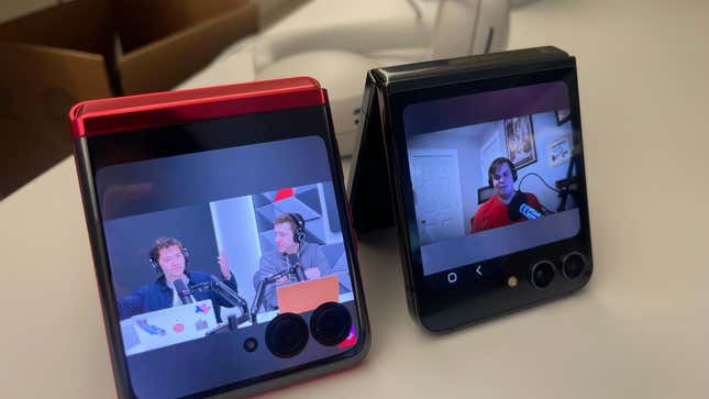
The Razr+ has a 6.9-inch main screen and a 3.6-inch exterior screen. It’s slightly larger than the 6.7-inch inside display and 3.4-inch outside display on the Z Flip 5. On top of the larger size, the Razr+’s exterior screen sometimes wraps around the camera lenses, giving it quite a bump.
However, the wrapping around the lens feature can sometimes be bothersome, especially when the lenses conceal something you need to click on. I ran into this issue often on YouTube when the Skip Ad button would be completely hidden behind the lenses, and I’d have to exit full screen for the button to change position, click on it, and then re-enter full-screen mode. Also, the screen doesn’t always wrap around. Chrome and Gmail were trimmed from the bottom, making the cover screen around the same size on both phones.
The overall functionality of the Razr+ is enhanced by the fact that it supports every single app on your phone out of the box, as opposed to Samsung’s annoying exterior screen that feels more like a watch face than a phone screen. You only get a handful of widgets there that you can use to tell the temperature or check the calendar. To be able to access more services, you need to head over to settings and enable up to just five more pre-determined apps.
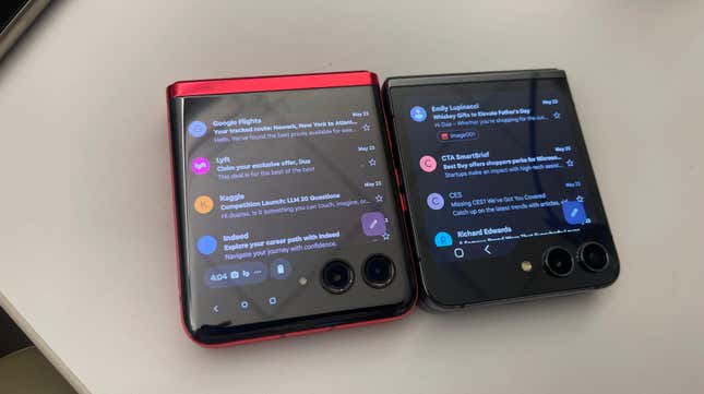
If you want to access anything outside of those five apps, you’re going to have to put in a lot more work. It includes navigating to Samsung’s Good Lock app and enabling a launcher widget that’s going to sit on your exterior screen and allow you to use the apps of your choice. Kyle Barr reviewed the Z Flip 5 unit I’m using and already did that work for me. But to add an app to the cover screen, I still had to scroll to the Good Lock screen, tap the add button, and then flip the phone open to add the apps I wanted. It doesn’t let you do that with the phone shut.
The Razr+, on the other hand, offers all those widgets and an incredibly simple interface for adding apps to the exterior screen. I just had to scroll to the Apps screen, click the pen icon, and tap on the apps of my choice—without cranking the phone open.
Both phones ship with Android 13, but the Z Flip 5 received an Android 14 with the OneUI 6.1 update back in December, while Motorola is still waiting on one. The older Z Flips also were updated to Android 14 around the same time. Samsung, typically, has a better track record of releasing updates on time.
Samsung is also more future-proof than Motorola. Motorola promises three Android upgrades and four years of security patches, while Samsung offers four years of major OS updates and a five-year window of security updates.
Samsung Galaxy Z Flip 5 vs. Motorola Razr+: Performance
The Z Flip 5 sports a 3,700 mAh dual battery that managed to last around a day, slightly short of what the 3,800 mAh battery on the Razr+ gave me. I would often find the Z Flip 5 dead in the morning after using it for an entire day, while the Razr+ often gives me around at least a day and a half. I am currently battery testing and will update this story with exact figures soon.
The Z Flip 5 is running the Qualcomm Snapdragon Gen 2 processor with 8GB of RAM and up to 512GB of storage space. The Razr+ sports a Snapdragon 8+ Gen 1 chip, which is powerful, though it’s not quite as up-to-date as the Gen 2, which achieves a higher peak CPU performance. The Razr+ offers 8GB RAM but tops out at 256GB of storage space.
While the two phones feature more or less the same number of gestures, the Z Flip’s are significantly more intuitive. Let’s take multitasking, for instance. Both phones offer a seamless split-screen function that allows you to perform two completely different tasks simultaneously. On the Z Flip 5, that’s activated by swiping up on the display with two fingers, which always works as expected. On the Razr+, you’re required to swipe your finger back and forth across the screen and then hold it on the edge of the display to see your screen split in half. Not only is the Razr+’s shortcut significantly less intuitive, but it is also unreliable. More often than not, I had to repeat the gesture to get it to work.
What makes the split screen feature on the Z Flip 5 even better is the option to favorite a specific multitasking view. For instance, if you’ve been using your phone to take notes during the online course, you can star that combo and place it on your home screen. That way, it’ll pop up in a single tap and save you the effort of enabling the gesture and choosing your two apps every single time.
The gesture for screenshotting on the Z Flip 5 is swiping your palm across the display, and it’s pretty lenient about the speed, intensity, and direction of your swipe. In fact, your palm doesn’t even have to necessarily touch the bezels on each side. It’s quick, easy, and intuitive. The Razr+ requires you to touch and hold the screen with three fingers, which obviously led to a ton of mistakes. I had to make sure my three fingers came in contact with the display at the same time, or I’d always end up accidentally tapping something with the finger that went down a split second earlier.
Samsung Galaxy Z Flip 5 vs. Motorola Razr+: Camera


The Z Flip 5 includes a dual-camera array with a 12-MP ultra-wide lens and a primary 12-MP wide-angle lens. The inside camera—the “front-facing” camera—is a 10-MP selfie camera. The Razr+ also has two cameras: a 12-MP main sensor and a 13-MP ultra-wide angle lens. There’s also a 32-MP selfie camera on the inside.
The Razr+ was a delight to shoot with. The photos it produced are crisp, bright, and clear. The higher resolution camera on the inside also pays off, as photos appear sharper than on the Z Flip 5. Samsung’s images on the Z Flip 5 skew grey on overcast days and can appear less vibrant. Accessing the camera on the Razr+ is also easier thanks to its Quick Capture feature, which fires the camera app when you twist your wrist twice. The phones also offer a shortcut to double-press the power button to open up the camera. Still, I liked the Quick Capture shortcut on the Razr+ better since it was considerably faster than the double-press and had haptic feedback, too.
Verdict
The Razr+ has a tighter hinge, but it doesn’t feature the painfully obvious crease that the Z Flip 5 does. It looks much better thanks to its leather coating, isn’t prone to scratches, sports much larger screens (both inner and outer), and offers very convenient app functionality for the outer screen. Featuring a slightly larger battery, it lasts longer than Samsung’s flagship foldable and offers better camera results. Its dust resistance score is better than the Z Flip 5’s, which matters a lot in a clamshell phone like this.
The Z Flip 5 is easier to flip open and has better water resistance than the Razr+. Its Qualcomm Snapdragon Gen 2 CPU is more up-to-date than the Razr+’s Gen 1. It also offers considerably more seamless navigation than the unintuitive UI on the Razr+. It also features the latest Android 14.0, which puts it a whole year ahead of the Android 13 on Razr+.
If I’m investing $1000 bucks in a phone, I’d expect peak performance, updated software, and a smooth UI over everything else. A cleaner aesthetic or better dust resistance isn’t of much use to me when my day-to-day with that phone is a pain because of a slow CPU, an outdated OS version, or a poorly designed interface. After spending weeks with both foldables, I found the Z Flip 5 ticking all the essential boxes and proving to be a considerably more promising phone than the Razr+.

