This Is Not the Samsung Wear OS Watch I Was Expecting
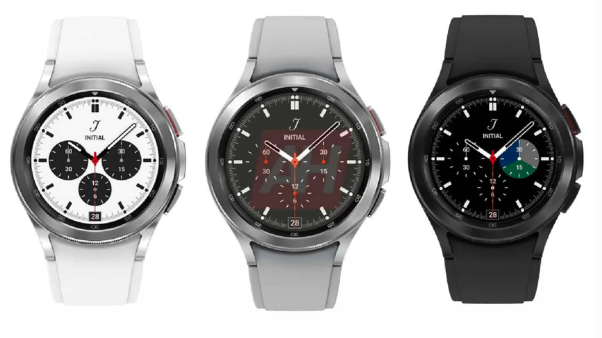
Last week, we got a glimpse at what the rumored Samsung Galaxy Watch Active 4 might look like. This week, Android Headlines leaked what it claims are renders for the flagship Galaxy Watch 4 Classic. But, looking at the design itself, perhaps Samsung is going a little too classic.
The design isn’t that different from Samsung’s Galaxy Watch 3, which is an incredibly beautiful smartwatch. The Classic tweaks the side buttons to be larger and flatter than the pushers on the Galaxy Watch 3. It also removes any gap between the lugs and the strap. The pictured straps also appear to be made of silicone, and there are fewer color selections: a white and silver model, gray and silver model, and an all-black model. And for longtime Samsung fans, some excellent news: It looks like the physical rotating bezel isn’t going anywhere.
As for what we can’t readily see, it appears the watch will feature Gorilla Glass DX+, and come in aluminum and stainless steel options. Surprisingly, Android Headlines contends that the Classic will also come in three sizes: 42mm, 44mm, and 46mm. This is a welcome change for the smaller-wristed among us, but overall, the renders suggest Samsung is playing it safe. Look, this watch isn’t a hideous fashion crime—but it doesn’t distinguish itself in the way we’ve come to expect from Samsung wearables in the past few years.
If there was a time to make a bold statement, now would be it. Earlier this week, Samsung gave a sneak peek of its One UI Watch experience, which will layer on top of the new unified platform it’s built with Google. Leaving Tizen behind was a Big Decision and one that may very well shape the next few years of Android-friendly smartwatches. A design shift would also be a strong way to throw down the gauntlet to Apple, which is also rumored to be working on a redesign for the Apple Watch Series 7.
Another mild concern is that none of these seem particularly feminine. A gripe with the old guard of Samsung smartwatches was they dwarfed smaller wrists and felt very much like a men’s luxury watch. As time went on, Samsung did a good job of including sleeker, more inclusive alternatives. Last year’s Mystic Bronze Galaxy Watch 3 is a perfect example of taking a masculine design and softening it to appeal to more people and styles. It was a look that was rare among Android smartwatches and set the Galaxy Watch 3 apart. The 2018 Galaxy Watch also had a stylish rose gold-and-blush option. Sure, the Active 4 looks to be a more unisex option, but the Active models are usually not as powerful as the flagship Galaxy Watches. Of the three options we see here, the white version looks like it might be the most versatile—but it feels like a step back.
G/O Media may get a commission
Listen, I get it. I really do. Samsung has quite a bit riding on the success of these watches, which it said will be officially unveiled during its Unpacked event next month. Sticking with a familiar design might be its way of hedging because big changes are inherently nerve-wracking.
That said, sometimes a bold visual break is a useful signal to consumers that we’ve entered a new era. Take Apple’s Spring Loaded event. To signify the dawn of the M1 iMac, Apple chucked aside the last decade’s worth of silver-and-black aesthetics for an explosion of color. Not only was it an homage to the iMac’s colorful past, but it also helped differentiate the old from the new. Samsung is taking a bold step in its wearables strategy, but visually, it seems to be telling us not much is changing.
Ultimately, design is only one factor in whether a product sinks or swims. I’ll be the first to admit that I put way more emphasis on how well a smartwatch works than if it’s a stunner on my wrist. (Though, you know, that definitely helps!) And, of course, these are simply leaked renders. It’s entirely possible the watch itself might be more impressive in person. After all, I wasn’t sold on the Mystic Bronze Galaxy Watch last year until I actually wore it.
But more than any other type of tech, wearables present an opportunity for people to express their personal style. It’d be cool if more companies leaned into that instead of saddling us with a parade of Apple Watch and Rolex clones.

